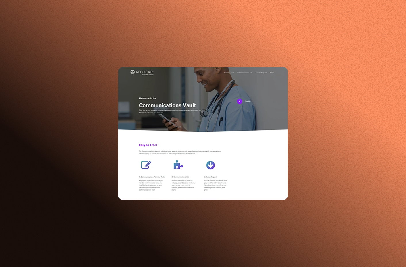
Every time a new client went live with the app, someone had to make 18 assets from scratch.
Communication Leads at each client organisation needed a full set of branded materials, covering everything from email banners to roller banners, across both digital and print formats. Before this tool existed, that work was either outsourced to a design agency or handled in-house by our design team. Either way, it meant waiting. It meant back-and-forth. It meant clients not fully knowing what assets were even available to them.
As our client base grew, this process wasn't going to scale. We needed a way to hand that customisation directly to the people who needed it.
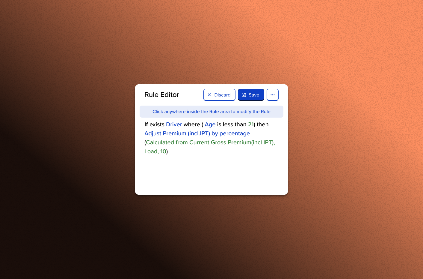
I designed a web-based tool that allowed Communication Leads to browse the available assets, upload their logo, and generate personalised files ready for use — without ever contacting a designer or agency.
That sounds straightforward. The harder part was everything underneath it.
Working across 18 assets spanning digital and print meant navigating two different colour modes (RGB and CMYK), multiple sizes, and varying aspect ratios. Each asset needed to look intentional for its channel, not just stretched or adapted. At the same time, they all had to feel like a cohesive visual family. I worked closely with the developer throughout to make sure the logic behind the customisation would hold up in production, particularly around how logos scaled and how text proportions responded to different canvas sizes.
The form itself needed to make a technically complex process feel simple. I focused on helping users quickly understand what was available, visualise what they were selecting before committing to it, and move through the customisation steps without friction.
The assets spanned digital and print: email banners, social cards, letter headers, roller banners, posters, and more. Each format had its own constraints — bleed requirements for print, pixel dimensions for digital, safe zones for text. The challenge wasn't designing one asset that worked everywhere. It was designing a system where each asset felt considered for its context, while still being unmistakably part of the same branded set.
That required making a lot of decisions upfront — about typography scale, logo placement rules, background treatments — so that the tool could apply them consistently without a designer in the loop.
The customisation flow had to work for Communication Leads, not designers. Many users wouldn't know their logo file format or colour codes off the top of their head. Some wouldn't be confident uploading files at all.
I structured the form to reduce cognitive load at each step: showing only what was relevant at that stage, previewing outputs before generating them, and using plain language throughout. The goal was to make a technically complex process feel like filling in a straightforward form.
This project was an early turning point for me as a designer. At the time, I was working primarily as a visual designer, and this was one of the first times I had to think seriously beyond the canvas.
Designing assets for a self-service tool is different from designing for a brief. The files had to work without a designer in the room to correct them, adjust them, or explain them. That shifted how I thought about constraints, consistency, and what it means to design something that functions in the real world rather than just looking right on screen.
We delivered on time for the first wave of clients going live with the app. Seeing those assets in use — created by Communication Leads who had never touched our design tools — was the moment I started to understand what design is actually for.
Seeing those assets in use, created by people who had never touched our design tools, was the moment I started to understand what design is actually for.
This was earlier in my career, before I had established formal user research practices. The project was requirements-driven rather than research-led. I'm including it because it represents a genuine shift in how I approached design work, and because the craft and delivery challenges were real.
I now bring a much more research-grounded approach to projects — you can see that in my Dynamic Pricing Tool and Pay by Link case studies.