When I joined Open GI, a colleague had recently completed the first round of usability testing on Dynamic Pricing Tool. He had championed internal testing as an alternative to outsourcing, and his groundwork gave me a valuable starting point. I joined the usability sessions as an observer, watching five brokers work through what should have been a simple task: create a pricing rule.
Only two of them succeeded.
That 40% success rate became the challenge I would take forward. As my colleague moved on to other priorities, I had the opportunity to take ownership of the product. Over the next three years, I would transform it from an early MVP into a production tool used by live clients, build on the usability testing practice he had started, and learn lessons about building scalable enterprise software that I carry into every project since.
This case study is about the product, but also about how designing it shaped me as a designer.
To understand why this product mattered, you need to understand what insurance brokers were dealing with before it existed.

Picture a large broker house with 200 agents. A customer calls about motor insurance. The agent needs to apply the right pricing adjustments: young driver loading for anyone under 26, no-claims bonus for loyal customers, perhaps a promotional discount running this month. Now multiply that by hundreds of quotes per day, across hundreds of agents.
Before DPT, brokers handled this in one of two ways:
If brokers wanted custom data enrichment, such as giving discounts to members of a specific partner, they had to pay a service and do a contractual agreement with us to configure it. This took weeks and created ongoing support costs.
The result was inconsistent pricing across organisations, compliance risks from manual errors, and frustrated brokers who knew there had to be a better way.
DPT was designed to solve all of this: a self-service, cloud-based rule engine that would let brokers automate their pricing strategies without relying on spreadsheets, legacy software, or external configuration.
The concept sounds straightforward: let users create pricing rules. But the execution was anything but simple.
Our users were experienced brokers with deep knowledge of insurance products and pricing strategies. They knew exactly what they wanted to achieve. The challenge was building a system powerful enough to handle complex logic while remaining intuitive enough that they did not need to be programmers to use it.
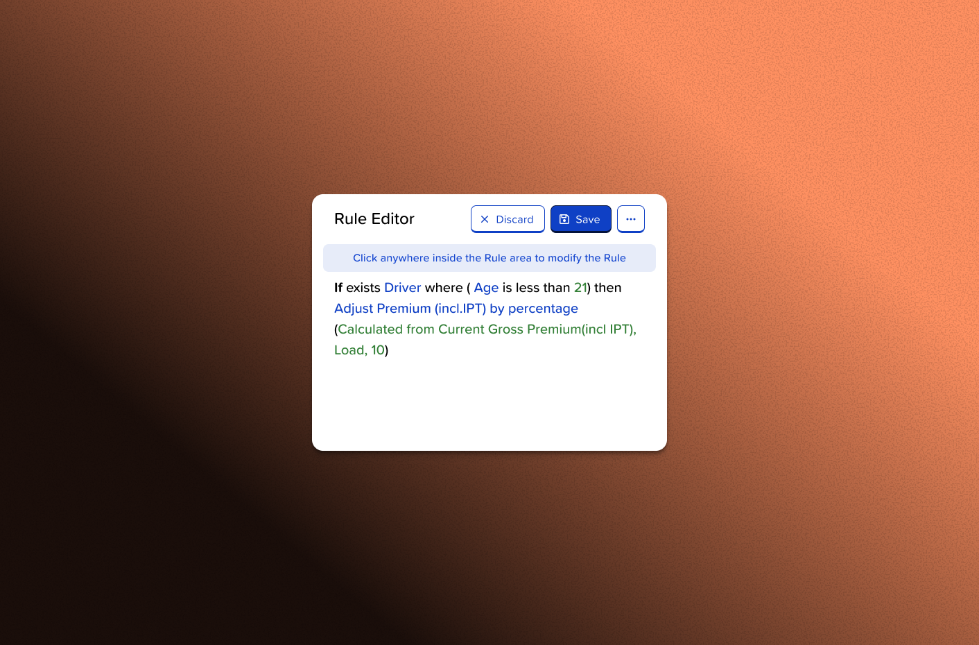
A typical rule might read: "If the policyholder is under 26, has no criminal record, and was born in the UK, apply a 15% loading to the premium." Behind that simple business logic lay nested conditions, data type handling, error states, and edge cases that could trip up even technical users.
When I observed that first usability test, the 40% success rate told only part of the story. Watching the sessions revealed something important: users were not just struggling with tasks, they were confused about fundamental concepts. Four out of five participants went straight to creating "snippets" when they should have been writing rules. They did not understand what snippets were for, or why they would want to use them.
The product had a conceptual problem, not just a usability problem. Fixing that would require more than interface tweaks.
I took ownership of DPT at a pivotal moment. The MVP was built. The first usability test had surfaced important problems. And the foundation for research had been laid.
Along with my manager I made a decision that would shape my approach to design going forward: I would own this product end-to-end, and I would build my design process around continuous testing and iteration.
5 participants • Post-development testing • 40% task completion
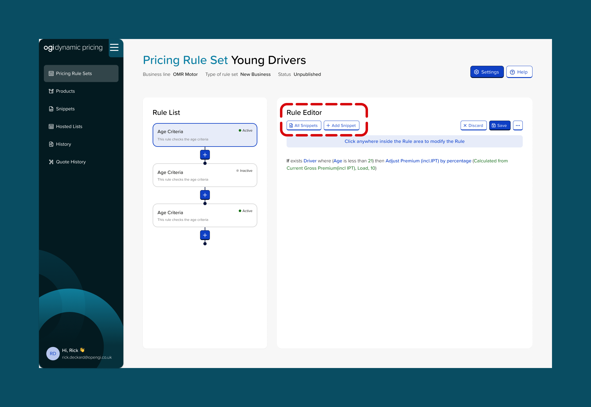
The first round, which I observed and helped analyse, revealed that our information architecture needed rethinking. We had designed snippets as reusable code fragments, pieces of logic that could be incorporated into multiple rules. Modify the snippet once, and every rule using it would update automatically. It was a powerful feature for advanced users.
But we had placed snippets front and centre in the interface. Users saw them immediately and assumed they were a required first step. One participant created three separate snippets for a task that needed none, a simple rule that should have been written directly in the editor.
The insight: Snippets were not the problem. Their prominence was. We were surfacing an advanced feature to users who had not yet mastered the basics.
The solution: I moved snippets to a dedicated management page, removing them from the primary rule creation workflow entirely. Users could still access them when they needed reusable logic, but they would not stumble into them by accident.
6 participants • Post-development testing
With snippets relegated to an advanced section, the second round revealed new problems, ones that had been masked by the earlier confusion.
The publishing workflow proved particularly challenging.
Didn't find it particularly easy. Feels like there's too many clicks.
Four out of six participants either forgot to publish their rule sets or could not find the publish option. They had done the work, but their rules were not live. In production, this would mean brokers believing their pricing was automated when it was not. One user captured the core issue:
"It was easy to follow the task, but just remembering to publish it to live."
What made these findings valuable was the contrast with what worked well. Users appreciated the visual design: "Very user friendly, colour coded statuses, drafts and affected products, filtering in the tables." The search functionality landed well: "Being able to search for the products was nice and easy." And once users found the publish option, they understood the pattern: "Everybody knows there are options behind the meatballs menu, so it was quite easy once I got there."
The insight: Users needed the critical action surfaced, not hidden. The interface had good foundations, with clear visual hierarchy and helpful search, but the most important step was tucked away where users did not think to look. The flow also required too much navigation between separate pages for rule creation, product assignment, and publishing.
The solution: I proposed combining rule creation with product assignment into a single page using a two-step flow: create rules and assign products and a clear and visible publish CTA. This would make the whole journey more intuitive and reduce the need to navigate to the products page and then back to rule sets for publishing.
4 participants • Pre-development prototype testing • 100% task completion
The third round marked a turning point, not just for the product, but for how I approached design.
We were building custom enrichment data, a feature that would let brokers upload their own data for use in pricing rules. Previously, if a broker wanted to give discounts to members of a specific club, they would contract with Open GI. We would quote a price, configure it manually, and it would take weeks. This feature would let them do it themselves in minutes.
I remembered the lessons from Takes 1 and 2. Both had been post-development tests, meaning we built the feature first, then discovered problems. Fixing them meant rework, developer time, and delayed releases.
For Take 3, I tested prototypes before any code was written.
The prototype testing revealed issues I could fix in Figma: confusing terminology ("auto-mapper" meant nothing to users), unclear navigation (the "Add" button was more prominent than "Next"), and technical language that did not match how brokers thought about their data.
The result: 100% task completion. Average time of 7 minutes. Zero rework needed after development.
That experience changed how I think about design timelines. The cost of testing early is hours of my time. The cost of testing late is weeks of the team's time.
By the end of three testing rounds, task completion on basic rule creation had improved from 40% to 75%, an 87.5% improvement.
But the numbers only tell part of the story. What changed was not just the interface. It was users' understanding of the product.
In Take 1, participants did not know what they were doing. They clicked on things that looked clickable and hoped for the best. By Take 3, they had a mental model that matched the system's logic. They understood that rules were the core unit, that snippets were optional enhancements, and that publishing was the final step to make changes live.
We had not just fixed usability issues. We had rebuilt the conceptual architecture of the product.
DPT is now live with three clients. Brokers use it to automate pricing strategies that once required spreadsheets. The product handles many scenarios like loadings and discount which can be based on age, no-claims bonuses, club membership discounts; Alternative outcomes can be automatic decline or refer rules for high-risk quotes.
Custom enrichment data transformed a weeks-long, expensive service into a self-serve feature. Brokers can now upload their own data and start using it in rules within minutes, with no contract required and no ongoing support costs.
The prioritisation framework I started using with the Product Owner, scoring issues on risk, business impact, and user impact, became the standard approach for the team. It gave us a shared language for discussing trade-offs and made stakeholder conversations more productive.
Internal usability testing became standard practice at Open GI. We moved from outsourcing research to running it ourselves, which meant faster feedback loops, lower costs, and deeper team understanding of user needs.
During Take 3, I invited a newly joined designer to observe the sessions. They subsequently ran their own testing rounds on other products, spreading research-driven design practices across the team. What started as my learning process became the team's methodology.
DPT was my first experience owning a product from early stages through production deployment. When I joined, I had observed one usability test. By the time we shipped, I had conducted three rounds with fifteen participants, built a prioritisation framework the team still uses, and helped establish research as standard practice.
Here is what the experience taught me: